That time of year always comes around again – your acceptance letters and financial aid packages have been sent and now millions of students around the country are faced with making a very important decision about their futures.
It’s yield season!
Sure, it’s stressful, but it’s also an exciting time to see how all your hard work is going to pay off. And, while we at Waybetter Marketing always believe that yield begins with the first touch, there’s so much you can be doing with your accepted students so they are more inclined to choose you.
First, let’s not forget who our audience is. Let’s talk about Generation Z.
- Impress them: You only have about 8 seconds to win them over – not because they have short attention spans but rather a strong filter for what is worthy of their time.
- Keep it real: They value transparency and authenticity above all else and can quickly sniff out things that aren’t.
- Personalization is key: Just like each of their social feeds, the expectation for personalization is high. They are digital natives that expect intelligent digital experiences. You have the data, you know so much about the student – so use it!
Knowing this, how will you change and optimize your touchpoints with accepted students?
One of the easiest places to start is with your student status/portal page. Too often these are seen just as transactional touchpoints with students – a place to upload documents, reference admissions checklists, and pay a deposit.
But, it should be so much more than this!
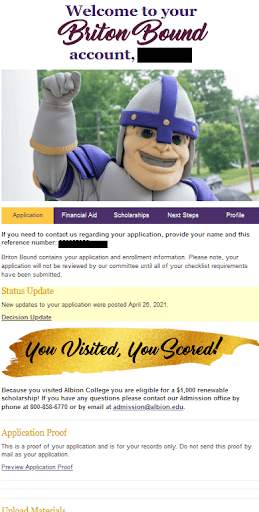
See below for a standard configuration example.

Your portal page needs to strike the ultimate balance of telling a great, personalized story and facilitating enrollment. And the good news is that you have all the data to make it happen! Don’t forget these are students that have been applied (most of them admitted!). You know so much about the student at this point, and now it’s time to harness that data.
Sounds great, but don’t know where to start? Well, let’s first discuss what dynamic content you could be surfacing on your portal.
- Academic Interest: Obvious, I know – but programming is a major component of a student’s choice. So, help to paint the picture by including student quotes and providing information about program-specific hands-on experiences and outcomes.
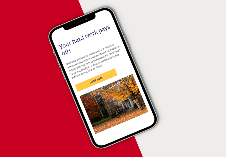
- Financial Aid: It can be a tricky thing for a student to navigate, so be as transparent as you can. Don’t hide the merit scholarship in your acceptance letter – prominently display it on the portal to create excitement and engagement.
- Next Steps: From changing application statuses to decisions, it’s important to explicitly let students know what it is they’re supposed to do. From uploading missing materials to replying to an offer of admission to making a payment, this should be dynamic and ever-changing.
- Staff Assigned Counselor: Take advantage of the hard work you’ve already put into your staff assignment/territory rules and introduce students to their main point of contact.
- Citizenship: Domestic and international students have different admissions processes, requirements, and aid options, so be sure they are seeing the correct information.
- Student Type: The same goes for first-year and transfer students. Be sure you’re communicating with transfer students about the credit transfer process and specialized scholarship opportunities.
And of course, this list could go on and on. If you have the content and the proper data flags on the back-end, you can personalize everything a student sees. In doing so, you’ll be accounting for everything on that Gen Z checklist:
Impress them ✓
Keep it real ✓
Personalization ✓
When it comes to your budget and personnel resources, there’s no better time nor a better population to invest in. And it will be so worth it.
When you build a portal that becomes a one-stop shop for the student while being a great representation of your brand, you’ll find portal visits will increase YOY. In fact, WB partners typically see a 50-60% increase in portal page visits. Relevancy, transparency, and personalization always drive action!
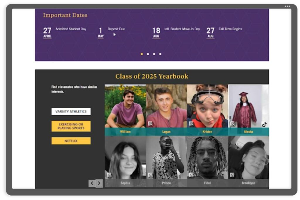
I mean who wouldn’t want to visit a portal with content like this:

Step up your student experience this yield season (and the ones to follow!) and take your portal page to the next level.
If you’re looking for inspiration or help, reach out and we’ll give you a private demo of the portal pages we’ve configured and the results they’ve generated!
