The goal of most of these pieces of communication is to simply to stay in touch with prospective students as they commence the long process of narrowing their college options. And, as far as I’m concerned, the majority of this comm flow flotsam is TOTALLY FINE. Sure, some of it’s a little generic, and some of it’s super high-end and eye-catching, but most of it’s pretty anodyne—just a steady, irrigating sprinkle in the very long drip nurturing cycle.
Rarely do I see anything that’s objectively bad.
Until, that is, application and visit season start up in the fall. Then things get dicey, not from a design or copywriting point of view necessarily, but from an actual marketing point of view.
Calls to action (come visit!) get buried in fussily designed multi-fold invitations or at the bottom of overly long emails. Instructions to apply get crowded out by generic brand messaging and ill-conceived information hierarchy. Deadlines get relegated to footnotes and superscripts. Info about affordability or the availability of merit aid is, dismayingly, nowhere to be found.
Look, I get it, direct marketing (straight-up requesting that somebody do the thing you want them to do) can feel gross and transactional when done wrong, and you don’t want your august higher ed brand to feel that way, but you also can’t be so coy that you never ask for the thing you need. It doesn’t help your institution, and it doesn’t help the students who need clear, easy-to-follow instructions for how to find their way to you.
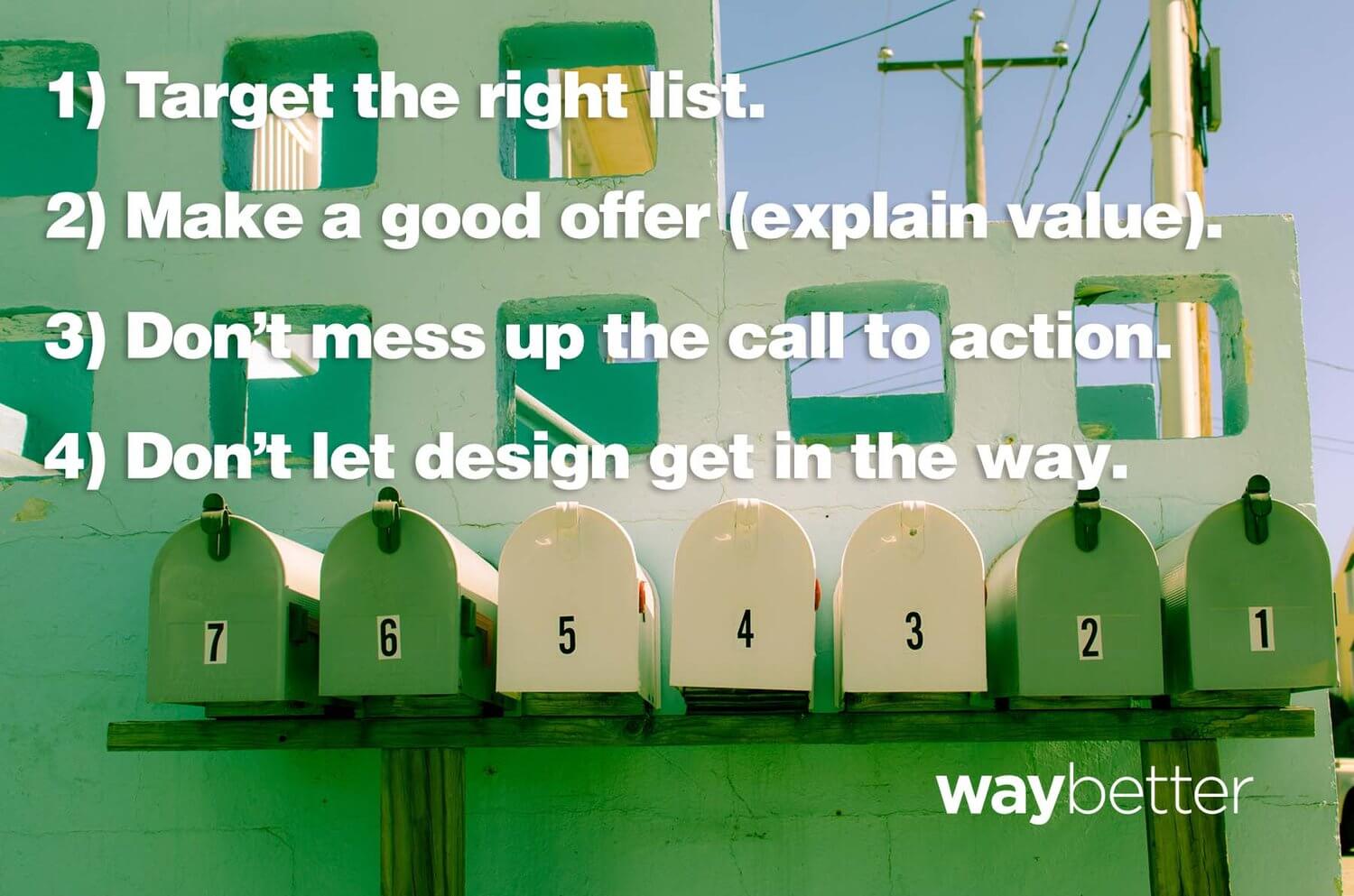
So, as yet another try-to-get-a-bunch-of-16-year-olds-to-pay-attention-to-you season rolls around, here’s a quick refresher on the direct mail/email rules you should follow if you want someone to notice you and take action:
1) List is most important. Targeting the right audience = success.
Okay, so how do you know you have the right list? Well, lucky for us in higher ed, getting lists of prospective students is easy. But think beyond your purchased lists for a second… are you accurately flagging responders from search campaigns in your CRM and treating them with the care they deserve? Have you loaded forms from summer open houses and RFIs that came through the web? Good. You can’t win if you’re marketing to the wrong people.
2) Make an offer. Good offer = success.

This one is tough. In higher ed, we don’t typically make conventional “offers” to students. Even when we do, it’s not until after they’ve applied and been admitted and it’s time to award their financial/merit aid.
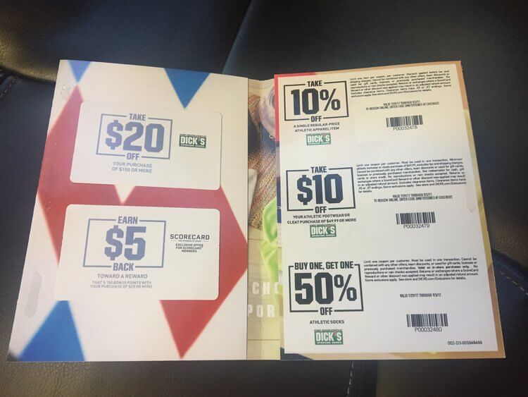
Compare that approach to the piece of mail I just got from Dick’s Sporting Goods—an all-business little trifold thing that contains no less than seven explicit financial inducements to get me to shop with them. These include everything from whole dollar discounts and percent discounts to credit card offers and a price match offer.
Imagine if you could do that with your university’s tuition!
Look, I’m not arguing, of course, that you include coupons or that you flaunt your discount rate. That would be…crazy. But why not talk about merit aid just a little bit earlier? How much more legitimate interest could you drum up if students and their parents knew you didn’t cost as much as they think you do?
The perceived cost of higher ed is perhaps the single biggest obstacle between you and prospective students, especially first-generation college students and low-income students. Why not give them a truer idea of the cost of attendance before they apply? Why not use cost as an incentive to get them to apply?
If you can’t do this, then do your best to clearly explain the benefits and value of visiting or applying, or whatever it is you’re trying to get them to do. But whatever you do, be sure to make it about them—if they understand how they’ll benefit, they’ll be more likely to do the thing you want them to.
3) Don’t mess up the call to action. Clarity = success.
This should be obvious, but be explicit about the thing you need your prospective students to do! Fill this out. Click here. RSVP here. Return to. Apply today at _________. You get the idea.
The call to action should be easy to see and easy to, you know, act on.
4) Design importance is minimal. Just don’t mess up the call to action!
I love beautiful design, don’t get me wrong. But if it gets in the way of good communication, it’s really not good design. When you need somebody to do something, be up front about it. Go ahead and dazzle them with your beautiful design skills in all the other touch points in the comm flow. But when you’re asking someone to do something, be clear, be brief, be direct.
Joel Anderson is Waybetter’s VP of Marketing & Strategy. Higher ed is all he knows
